AI Citation UX for Aesthetic Medicine: Our Mockups Hallucinated Before the Model Did
Before any model wrote an answer, our own mockups had invented citations. We redesigned an aesthetic-medicine learning platform so that every claim cites a printed page and every gap in its knowledge becomes a designed screen.
 28 min read
56 views
28 min read
56 views
- Claim-level citations In the design, each claim in an answer cites a page the reader can open.
- Design-time hallucination Placeholder citations in mockups are a real risk: our audit found 6 of 7 demo citations wrong and 4 invented.
- Designed refusals Honesty states belong on designed screens, not in error toasts.
- AI-assisted speed AI assistants turned what usually takes weeks of document review and concept design into 42 elapsed hours by our commit history, while human decisions and automated checks kept that speed honest.
Before any model wrote an answer, our own mockups broke the product's central promise. Our audit of the demo found 6 of its 7 citations wrong, and 4 of them were invented outright.
The product is Thalvera, an AI learning platform for aesthetic-medicine and longevity clinics. In the design, every answer cites each claim to a page the reader can open, and designed screens take over when the product cannot or must not answer. A handbook, a study and a regulator never share one citation style. Document review, concept design and verification took 42 elapsed hours (by our commit history).
Names are changed. Thalvera and The Longhaven Handbook are pseudonyms, and every screen shown is an illustrative recreation in our own style, not the client's design.
| Item | Detail |
|---|---|
| Client | An anonymous company building an AI learning platform for aesthetic and longevity practices |
| Product | Thalvera (a pseudonym) |
| Our role | Product discovery, knowledge engineering, UX and UI design, review deployment |
| Inputs | 8 client documents, 406 pages |
| Deliverables | Knowledge base and decision registers; 3 UX concepts with 91 desktop screens; 42 mobile screens; 3 visual directions in light and dark themes; a password-protected review site |
| Timeline | 42 hours from first to last commit, 22 to 24 September 2026; 12 working sessions |
| Status | Design phase; the client is choosing a direction |
| Source of figures | Commit history, project registers and design files as of 24 September 2026 |
An audit of our own mockups found 6 of 7 citations wrong
Our first concept pass filled its citation slots with plausible placeholders, and our own audit against the verified book found 6 of 7 demo citations wrong, 4 of them invented. A fake citation in a mockup is worse than obvious filler text, because it looks like the product working.
Thalvera's central promise is that every claim on screen can be traced to a printed page of The Longhaven Handbook, the practice handbook it teaches from. Our own design files broke that promise first.
We call this a design-time hallucination: invented content in a design artifact that looks like real, verified output. It needs no model, since a designer, a copywriter or an AI assistant filling a template can produce one.
Our audit covered every screen the client could see, with two methods. Pattern searches swept every screen file for page numbers above 272, Part numerals III to VI, subsection signs such as "§7.3" and the topics the book never covers. A manual check then compared each demo citation with the verified table of contents. On day one, the first pass flagged the problems. Corrections landed on day two, in a session of roughly six hours that also grew the desktop demo from 49 to 91 screens (by our commit history).
Before the fixes, our audit counted:
- 7 demo citations: 6 wrong, 4 of them invented outright, 1 exact match.
- 19 page references beyond the last printed page, 272. The highest was p. 402.
- 59 references to Parts III to VI of a two-Part book.
- 186 numbered subsections such as "§7.3", in a book that has none, which made phantom numbering the largest error class.
- 4 invented quotations, one under "Review: Approved · clinical reviewer".
- A version stamp of "v1.0", borrowed from a roadmap document.
- Three topics the book never mentions, chromophore competition, priming and a device utilization model, each cited by the demo although it appears zero times in the book.
Obvious filler text is honest about being fake. A placeholder citation with a page number and a review status can be carried into a meeting as evidence. Large firms have already published fabricated references. In October 2025 Deloitte agreed to repay part of an A$440,000 government contract after its report was found to contain a fabricated court quote and references to nonexistent research papers (AP). Its refund came to more than A$97,000 (CFO Dive). In May 2026 EY Canada removed a report it had published in 2025 after GPTZero found that 16 of its 27 references were hallucinated (Consulting.ca).
Our fix had four parts:
- One source of quoted text. 106 passages verified on their printed pages, 64 clinical and 42 business, are the only text the demo shows as the book's own words (by our book verification).
- Absent topics route to a designed screen. Such a question goes to "Not in the source", never to a nearby chapter.
- Honest review labels. "Approved" may appear only above verbatim text.
- A recount. By our recount at the latest commit, the desktop demo has zero out-of-range pages, zero phantom Parts and zero subsection numbers; the mobile screens are next.
We also specified seven assertions the book-ingestion pipeline must pass before any answer ships (in our book verification report), from no control bytes in any chunk to printed page equal to PDF page minus 13 for every chunk. They belong to the product build and are not running yet.
Our rule from the audit is "Never fake a citation": if content is not real, it must look unreal. A placeholder citation needs a dashed outline and the word SAMPLE, never a page number that merely looks right.
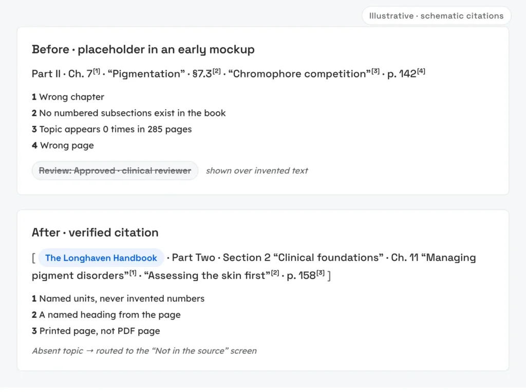
We verified the source book page by page before trusting a single citation
Our book verification read The Longhaven Handbook page by page: 285 PDF pages, printed body pages 1 to 272 and a fixed offset of 13 between them. Every citation in the design now follows the book's real structure, with printed pages and no invented subsection numbers.
We checked the file the way a retrieval model will ingest it. It is born-digital, created in a word processor rather than scanned (in our book verification). In its roman-numbered front matter, each numeral equals its PDF page. Body pages run from printed page 1 to 272, each equal to its PDF page minus 13, an offset we checked at all 272 body pages rather than at a sample. The book's table of contents now serves as a regression fixture, a structure any future ingestion must reproduce exactly.
Some figures carry labels that exist only as pixels, invisible to text extraction, so we asked the client for the source files instead of guessing.
Its structure is asymmetric. Part One is a sequence of numbered frameworks with no chapters. Part Two divides into sections whose chapters are numbered continuously across the whole part. Nothing is numbered below that level: a search for N.N patterns returns zero matches across all 285 pages.
That settled the citation format. A printed-page citation is a reference that names the part, the section (Part Two only), the unit title, a named heading from the page and the page number printed on it, so a reader holding the book can find the passage. It never carries an invented subsection number or a PDF page. In schematic form:
Part Two · Section [n] · [unit title] · [named heading] · p. [printed page]
Our guide to the RAG data pipeline covers the same discipline inside ingestion, where page mapping and chunk boundaries decide what a model can cite.
Trust in a medical AI product is a chain of seven design decisions
A medical AI product earns trust through seven linked design decisions, from tracing each requirement to its source to gating every output of the process. A weak link anywhere breaks the promise that every claim can be checked.
Aesthetic medicine raises the stakes. Everyday questions touch complications, device indications and marketing claims, and an untraceable answer can travel from a screen into a treatment room or onto a practice website. Marketing is already a weak spot: a 2024 study of 200 US practice websites found that 103 of them (51.5%) made at least one off-label claim about energy-based devices, measured against FDA-approved indications. Any AI for aesthetic medicine enters that environment and has to show where every claim comes from. For the wider field, read our guide to AI in healthcare in 2026.
Thalvera is our client's answer to that problem. It is a source-grounded AI learning platform: a product that answers and teaches only from sources it can name and shows the reader where each statement came from. Its first source is one practice handbook, The Longhaven Handbook, registered in the design as Corpus A and joined there by FDA records and external research from PubMed and ClinicalTrials.gov. Three promises follow: every claim carries its provenance, uncertainty stays visible and the product teaches rather than prescribes.
Our knowledge base counts 10 user types. Three role-based personas, all fictional, carry them through the design: a physician between patients, an aesthetician learning a technique and a practice owner planning investments.
We call the sequence behind every answer a trust chain: the ordered set of design decisions that lets a reader follow any claim on screen back to a verified source. Each link depends on the one before it, and a perfect citation marker is worthless if it points at a page nobody checked.
- Requirements: Trace every requirement to its source document, and list the documents your specification leaves out.
- Source: Verify the source page by page before any interface cites it.
- Artifacts: Audit your own mockups and demos for invented citations, because a design artifact can hallucinate as easily as a model can.
- Answers: Cite every claim.
- Limits: Give every refusal, withheld claim and clarifying question a full designed screen with a next step.
- Provenance: Keep the handbook, external studies and regulatory records in separate classes, each with its own citation format.
- Process: Put a human decision and an automated check behind every fast output.
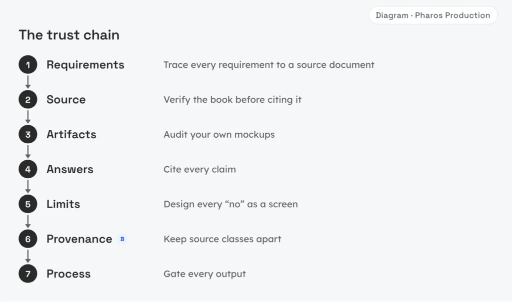
Our working spec was built from three of eight documents
The working specification we started from compiled three of the client's eight documents and carried nothing from the roadmap, the safety framework, the visual strategy or the book itself. Tracing every requirement back to all eight exposed gaps in the first answer design.
All 8 client documents total 406 pages (in our project register). By our requirements trace, the first answer design covered half of the components the safety framework requires and had 7 honesty states, screens for non-answers and limits, while the documents call for 11 more, led by an emergency-escalation state.
So we read all eight documents and built a register instead of a summary. In our decision register it now holds:
- 156 client decisions, each with a page reference
- 64 contradictions, 46 between documents and 18 inside single documents
- 89 prohibitions
- 63 glossary terms
- 31 questions for the client (5 blocking, 18 important, 8 confirmations), plus 3 requests for material
Three rules keep the register honest. Client decisions and our own live in separate ledgers that are never merged; the team ledger holds 8 decisions so far (in our decision register), so anyone can see which choices the client never made. Every claim in the knowledge base carries a page reference to a client document or the label "inference" or "ruling". Old entries are never rewritten: a correction is appended as a dated note under the original.
Three UX concepts let the client compare products, not screens
We designed three complete UX concepts, each with a different home screen, so the client could decide what kind of product Thalvera should be before debating layouts. All three share one answer card, one evidence panel and the same honesty states.
A single concept invites feedback on pixels, while three home screens force a product decision: Thalvera could be a place to ask, a place to read or a place to learn.
| Concept | Home screen | Best for | Strength | Risk | Screens, in our design files |
|---|---|---|---|---|---|
| A · Ask-first | Ask is home | A physician between patients | Fastest route to a cited answer | Reads as a chatbot; learning never starts if nobody asks | 32 |
| B · Book-first | Library and reader are home; the assistant docks to the open chapter and citations highlight lines on the page | Aestheticians, students and faculty | Strongest fit with the MVP scope | Reads as a PDF viewer; whole-book questions need an exit from chapter scope | 30 |
| C · Learning-path-first | A personal learning map is home; Ask and Library are tools inside it; a baseline test shows the gap between confidence and performance | Learners with a goal | Socratic "Teach Me" and "Test Me" with a confidence slider | Heaviest first run; may oversell later-phase features | 29 |
A citation behaves the same way whichever door the reader came through, and every MVP user story appears in at least one concept, so the comparison covers scope as well as layout.
Our recommendation is concept A's shell with concept B's reader: Ask-first gives the physician speed, and the docked reader keeps the book one click away. Concept C, which leans on later-phase features, stays as a later direction. The client decides, and nothing here is approved yet.
Three full concepts cost more than one polished concept, but they surface disagreements about the product while changes are still cheap. Our comparison of PoC, MVP and prototype sets out what each stage should prove.
A verifiable AI answer has eight parts
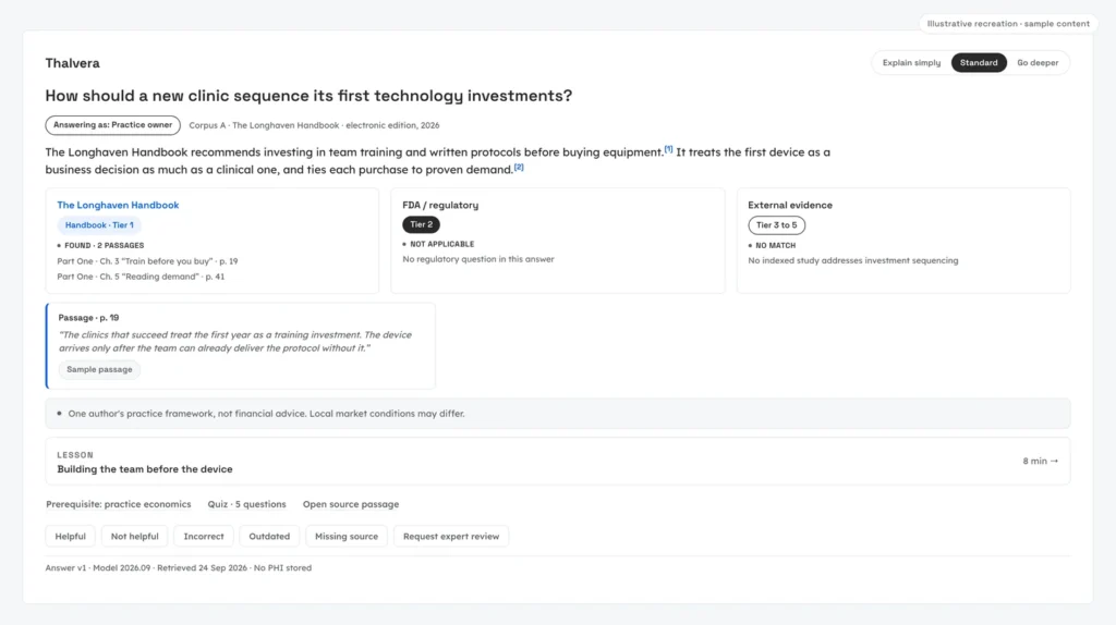
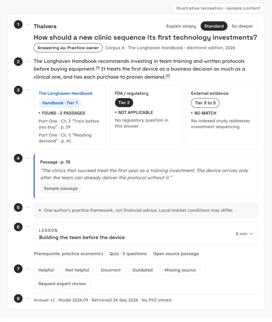
Citation UX for a verifiable AI answer comes down to eight parts: a header with role and source stamp, a summary, source classes, claim-level citation markers, limitations, a next step, feedback controls and footer metadata. Each part answers a question a careful reader asks before trusting the text.
Its core unit is the claim-level citation: a citation attached to one specific claim inside an answer, which opens the exact supporting passage instead of listing sources at the end. If an answer makes four claims, it carries four markers.
These eight parts, numbered in our design spec, are the card's own anatomy, a different list from the components the client's safety framework requires:
- Header. A role chip reads "Answering as: Physician" and the corpus stamp names the source and its edition. A depth control (Explain simply, Standard, Go deeper) changes depth and language, never the passages.
- Summary. Two to four sentences that answer the question directly.
- Source classes. Fixed columns, never merged, with the book first. Each shows one state (found, no match, not applicable or unavailable), and only "unavailable" is grayed out.
- Claim-level citation markers. One per claim, each opening the evidence panel at its passage.
- Limitations. A band on every substantive answer that says what it cannot claim, such as sources differ or awaiting clinical review.
- Next step. One lesson plus up to three secondary actions, so the answer ends in a route instead of an endless chat.
- Feedback. Six controls in a fixed order.
- Footer meta. Answer version, model version, retrieval date and "no PHI stored", a label that states a promise the build must keep and makes no compliance claim.
In the design, the evidence panel comes in three densities: a rail beside the answer, a popover on the marker and an open panel. At every density it shows class, location, verbatim passage, edition, evidence type, review status, retrieval date and the claims it supports.
Our demo's hero answer corrects the premise of its own question inside the limitations band, on purpose: nothing shows visible uncertainty more clearly than an answer that says the question assumed something the source does not say.
Six feedback controls always appear in the same order, so a practitioner finds the right one without reading the row. In the design, Helpful and Not helpful rate the answer as a whole. Incorrect opens a content fix against the cited passage. Outdated triggers a freshness check on the source and its edition, while Missing source records a coverage gap, a question the corpus cannot yet answer. Request expert review queues the answer for a human expert.
None of this starts from zero. The Nielsen Norman Group's piece on AI hallucinations and the citations pattern in Shape of AI are good starting points for showing sources; this case adds the regulated-domain version, with printed-page citations, full-screen non-answers and an audit of our own design artifacts. Retrieval engineering that fills these slots with real passages is the work of our RAG knowledge systems practice.
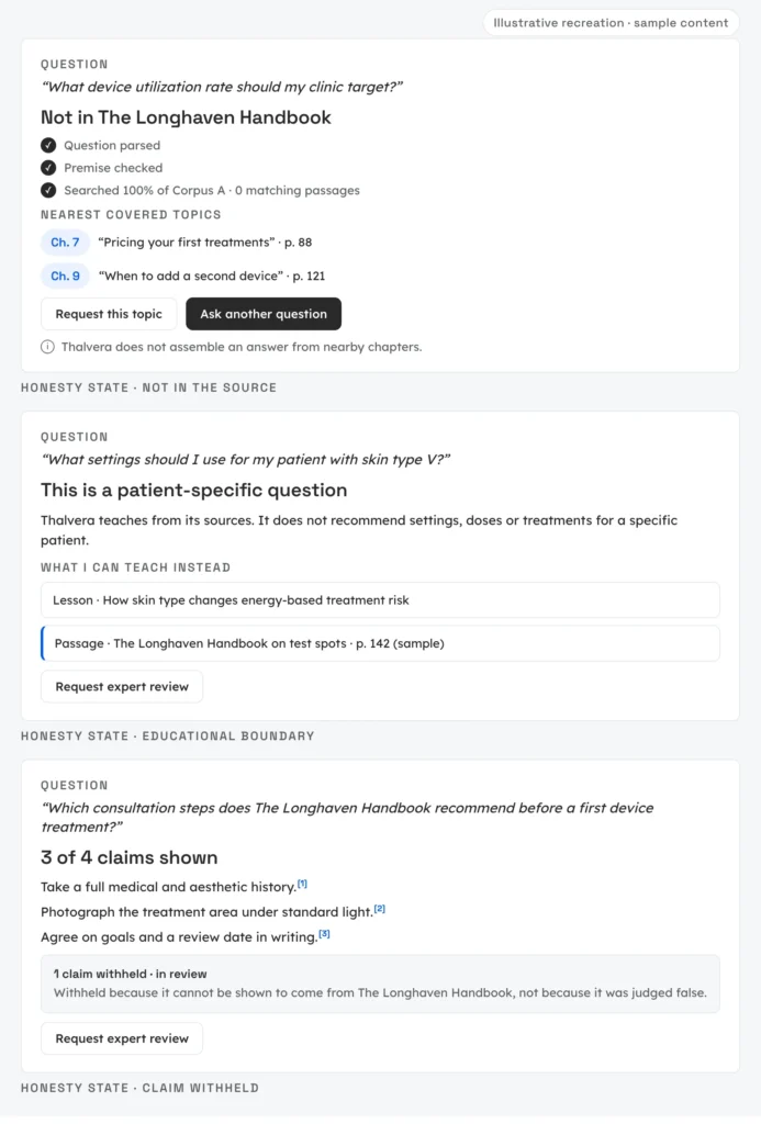
Honesty states are designed screens, not error toasts
Honesty states are how the design handles AI abstention: a full screen with a next step for every moment the product must refuse, withhold or ask back.
An honesty state is a designed part of the interface that tells the reader what the product searched and what it cannot or must not say, together with a next step. Unlike a toast, it stays on screen and offers a route. Of the seven designed so far (in our design files), five are full screens that replace or reduce an answer: not in the source, educational boundary, claim withheld, clarify and source updated. The other two, transparent retrieval and limitations, ride on every answer.
| State | Trigger | What the design shows | Why it matters |
|---|---|---|---|
| Transparent retrieval | Any answer | Named retrieval steps, including "Premise checked" | The search is visible, not only the result |
| Not in the source | No passage supports the question | "Searched 100% of Corpus A · 0 passages", the nearest covered chapters and "Request this topic" | Nothing is assembled from adjacent material |
| Educational boundary | A patient-specific question | A refusal plus what the product can teach instead | No settings, doses or treatments for a specific patient |
| Limitations | Every substantive answer | What the answer cannot claim | Uncertainty stays visible |
| Claim withheld | One claim cannot be traced | 3 of 4 claims shown; the fourth goes to review | Untraceable to the book, not judged false |
| Clarify | An ambiguous question | A question back before answering | No guessing |
| Source updated | The source changed after the answer was saved | The saved answer, kept, labeled and comparable side by side | Nothing is rewritten silently |
"Not in the source" states its search in numbers, which tells the reader the product looked everywhere it is allowed to look. Its nearest covered chapters give a path forward, and "Request this topic" turns the gap into a signal for whoever maintains the content.
An educational boundary refuses the patient-specific part of a question and keeps the teachable part: a physician who asks for one patient's device setting gets none, only what the book teaches about that kind of decision.
Claim withheld is the least familiar. An answer can go out with three traceable claims while a fourth waits for review, labeled as untraceable to the book rather than false, so a traceability gap never reads as a medical verdict.
An honesty state can be wrong too. A retrieval miss would show "Not in the source" for a topic the book does cover, a false refusal that looks like honesty. In the design, the three absent topics from our audit act as known negatives: they must always land on that screen, and covered topics must never land there. "Request this topic" doubles as a way for a reader to report a miss. Tests for both directions belong to the product build.
We prefer evidence labels to a model-confidence score. A confidence score describes the model's certainty, while a tier, like the maturity label planned for the design, describes evidence the reader can open and check.
One answer can hold three kinds of truth
A single answer can draw on the handbook, external research and FDA records, so the design keeps those three source classes visibly separate, each with its own citation format and chip. No class may borrow another's authority.
The client's source policy ranks evidence in tiers, and the interface shows three classes that are never merged. At Tier 1 sits the book, The Longhaven Handbook. FDA and regulatory records (Tier 2) show what a regulator has cleared, approved or warned about. External evidence in the lower tiers covers a synthesis, a primary study or a registered trial. Regulatory records come from the US FDA only; other jurisdictions are out of scope for now.
Each class cites differently: a book citation is a printed-page citation, while an external or FDA record cites an identifier (a PMID, a DOI, an NCT number or a 510(k) number) plus publication and retrieval dates, so a reader can tell the class of a source from its citation alone.
The design also separates sources the product retrieves from sources that shape it. Three retrieval connectors appear in it: PubMed through NCBI E-utilities, openFDA's 510(k) endpoint and the ClinicalTrials.gov API v2. AHRQ evidence reports are ingested as documents, while FDA digital-health guidance, WHO guidance and the NIST AI Risk Management Framework shape the architecture and never appear as answer sources.
None of these connectors is live. In the demo every external and FDA record is a sample, with a dashed SAMPLE mark and masked identifiers, and connecting the live APIs starts with a one-day verification spike.
That off-label pattern on practice websites is why regulators get a class of their own: a cleared indication is not evidence for an advertised use.
Color means provenance and nothing else
Provenance-only color is the rule that the interface's single accent color marks the book and nothing else. Role chips, depth controls and the brand mark stay neutral, the FDA chip is solid ink and external evidence gets an outlined chip that carries its tier, so a reader who learns the rule once can read provenance at a glance.
When sources disagree, the interface does not pick a winner
When external evidence and an FDA record disagree, a "Sources differ" block in the design shows them side by side, each under its own chip. The regulator takes precedence on regulatory status only; on what a study found, the study speaks for itself. Our demo uses exosomes, a frontier topic where the regulator's position is plain: FDA states that "There are currently no FDA-approved exosome products." A sample study record can sit beside that statement without either one being edited to agree.
The color rule survives the dark theme
We drew three visual directions of one answer screen. Every color and typeface is a token on the frame root, so a dark theme is a second set of token values over markup reused byte for byte. Of the three dark strategies, an inverted page makes the reading surface the darkest layer, layered surfaces make each nested layer a step lighter than its parent and the third relies on soft elevation. Any strategy pairs with any direction, for 12 frames, 6 light and 6 dark (in our design files).
Contrast was measured after compositing semi-transparent washes onto their real backgrounds. By our rule checker, run on 24 September 2026, the lowest text contrast per dark strategy is 5.0:1, 4.9:1 and 4.7:1, above the WCAG 4.5:1 minimum. On dark surfaces the accent keeps its hue and single meaning, so provenance reads the same in both themes, and the choice of direction and strategy stays with the client. Our UX/UI design cost guide breaks down what drives the price of this kind of exploration.
A medical learning AI must know what it will never say
Our decision register holds 89 prohibitions drawn from the client's documents, from diagnoses and doses to invented citations and unsupported FDA claims. The design turns them into visible structure, so a clinician can review the basis of every answer and keep the judgment their own.
They fall into four groups. Clinical prohibitions rule out diagnoses, doses, device settings and patient-specific treatment plans. Citation prohibitions rule out any invented citation, PMID, DOI, clearance, guideline or result. On the regulatory side, no "FDA cleared" or "approved" claim may appear without an FDA source, and a trial registration is never presented as evidence of a result. Source rules keep the book from being presented as FDA clearance or as independent evidence.
That on-screen structure lines up with how FDA describes non-device clinical decision support. FDA's Clinical Decision Support Software guidance, issued January 6, 2026 and reissued January 29, 2026, says a non-device CDS function must "enable HCPs to independently review the basis for the recommendations presented by the software so that they do not rely primarily on such recommendations, but rather on their own judgment" (PDF, p. 14). FDA also does not count software for critical, time-sensitive decisions as meeting that criterion.
In the design, the reviewable basis is concrete: claim-level citations show where each statement comes from, transparent retrieval shows what was searched, the limitations band shows what the answer cannot claim and the role chip shows who the answer was written for. None of this is a regulatory determination; it records design intent for an educational product that teaches rather than recommends treatment.
Two pieces are not designed yet. An evidence-maturity chip with three values, Established, Emerging and Frontier, is independent of the tier: a Tier 1 claim from the handbook can still be Frontier, and the reader deserves to see both facts. An emergency-escalation state for events such as vascular occlusion, visual symptoms after filler or anaphylaxis can get its layout now, while its words and its destination belong to the client's clinical lead. For the organizational side of written limits and named owners, see our AI governance framework.
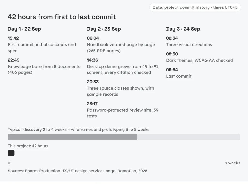
AI assistance turned weeks of document review and concept design into 42 hours
Discovery and prototyping usually take weeks, and much of that calendar time is desk work. AI assistants compressed the desk work here, while every step that depends on people kept its own pace.
Paid discovery takes 2 to 4 weeks on our UX/UI design services engagements, and wireframes and prototyping add 3 to 5 weeks by Ramotion's 2026 estimate; the UK government's service manual calls 4 to 8 weeks typical for a discovery alone (GOV.UK). Much of that calendar time is desk work (reading, reconciling, drawing and checking), exactly what AI assistants accelerated here. In this engagement the desk work took 42 elapsed hours, from 22 to 24 September 2026, with 69 commits across 12 working sessions (by our commit history and changelog).
Work that depends on people did not compress. The client's answers to our 31 open questions, user research and usability testing still run on calendar time, and all three are still ahead.
| Day and time (UTC+3) | Milestone |
|---|---|
| 22 Sep, 15:42 | First commit: initial concepts and working spec |
| 22 Sep, 22:49 | Knowledge base from 8 documents |
| 23 Sep, 08:04 | Handbook verified page by page; earlier findings retracted |
| 23 Sep, 14:36 | Desktop demo grows from 49 to 91 screens, every citation checked (about six hours, 39 commits) |
| 23 Sep, 20:33 | All three source classes shown in the demo, with sample records |
| 23 Sep, 23:17 | Password-protected review site with 59 automated tests (under three hours) |
| 24 Sep, 02:34 | Three visual directions |
| 24 Sep, 08:50 | Dark themes, WCAG AA checked |
| 24 Sep, 09:54 | Last commit |
AI assistants read and cross-referenced all eight documents, drafted the registers, generated and revised screens, wrote the tooling and ran the checks. People made every decision, ruled on every conflict between documents and accepted or rejected every change.
Speed has a side effect. When a screen costs minutes, a plausible placeholder costs nothing, and fast first passes are exactly where fake citations creep in. That is why the gates mattered as much as the speed. We bring the same way of working to AI product engineering.
Quality gates kept the speed honest
Every fast output passed an automated gate before anyone relied on it: byte-exact sync, a rule checker, headless layout checks and a tested review deploy. Automation caught what speed let through.
Each concept exists twice, as a design-canvas file and as a static HTML copy that opens in any browser and can be checked headlessly. A sync tool refuses to write unless the round trip is byte-exact, and only one side may change between two syncs, a rule dating from the session when the canvas fell 42 frames behind (in our project records).
A rule checker verifies canonical strings, token polarity and WCAG AA contrast, and its 30 unit tests pass (by our test run of 24 September 2026). Headless frame fitting makes sure nothing clips, no frame carries more than 160 px of empty space and full-width screens stay at least 1440 by 900. A visual lint catches text outside frames, collisions and squeezed columns.
Mobile screens are generated, not drawn: a Python generator with shared tokens and component constructors produces 29 planned screens plus 13 added after an audit against the user stories (in our design files). Nobody edits a screen by hand, so one constant changes the corpus stamp everywhere.
Our review deploy fails closed. Its static demo runs on a Cloudflare Worker behind HTTP Basic Auth, answers 503 if its secrets are missing, compares credentials in constant time and sends noindex and security headers. By our test run of 24 September 2026, 59 automated tests pass with 100% line and branch coverage of the Worker, and no test can reach Cloudflare. Every working session ends the same way: a dated changelog entry, a refreshed sync log, a commit and a push.
The engagement by the numbers
Every figure comes from the project's version-controlled records as of 24 September 2026, and each row names its record.
| Metric | Value | Source |
|---|---|---|
| Client documents | 8 documents, 406 pages | Project register |
| Client decisions recorded | 156 | Project register |
| Contradictions found | 64 (46 between documents, 18 inside one) | Project register |
| Prohibitions | 89 | Project register |
| Questions for the client | 31 | Project register |
| Source book | 285 PDF pages, printed body pages 1 to 272 | Book verification |
| Verified passages | 106 (64 clinical, 42 business) | Book verification |
| Demo citations wrong at audit | 6 of 7 (4 invented) | Citation audit |
| Page references out of range at audit | 19 | Citation audit |
| Phantom subsection numbers at audit | 186 | Citation audit |
| Desktop screens | 91 | Design files |
| Mobile screens | 42 (29 planned, 13 added) | Design files |
| Honesty states designed | 7 | Design files |
| Visual-direction frames | 12 (6 light, 6 dark) | Design files |
| Lowest dark-theme text contrast | 4.7:1 | Test run, 24 September 2026 |
| Automated tests | 30 plus 59 | Test run, 24 September 2026 |
| Commits | 69 | Commit history |
| First to last commit | 42 hours | Commit history |
What this case does not show yet
This case documents a design phase, not a product in use: nobody has tested it with users, no connector is live and the client's choices are pending.
- No user testing yet.
- The connectors are not live. Every external and FDA record in the demo is a sample record with masked identifiers.
- Mobile screens still await their correction pass.
- Neither the evidence-maturity chip nor the emergency-escalation state is designed.
- The seven ingestion assertions are specified but not running.
- Choices that belong to the client are pending, from the visual direction and dark strategy to the scope, so our concept recommendation remains a proposal.
Next come a one-day verification spike against the three connector APIs, the two missing safety pieces, an answer card that covers every component the safety framework requires, corrected mobile screens and the client's choice of direction and dark strategy.
Ten rules for AI answers people can verify
Ten rules from the Thalvera engagement: cite claims, cite pages a reader can open, never fake a citation, design every refusal as a screen and keep sources, colors and ledgers apart.
- Cite claims, not answers. Four claims deserve four markers.
- Cite the page a reader can open. A printed page beats a PDF offset or a chunk ID, and our minus-13 offset held at all 272 body pages because we checked every one.
- Never render a citation slot the source cannot fill. Our demo carried 186 subsection numbers such as "§7.3" for a book that has none.
- Never fake a citation. Our audit found 4 invented quotations that looked real enough to carry into a meeting.
- Design every "no" as a screen with a next step. Five of the seven honesty states replace or reduce an answer, and each one still offers a route.
- Show what was searched. "Searched 100% of Corpus A · 0 passages" is an answer in itself.
- Keep the book, the study and the regulator in separate classes. Off-label claims on practice websites show how easily a cleared indication and an advertised use blur.
- Let color mean one thing. Our accent marks the book, even in the dark theme.
- Never rewrite a saved answer silently. Our source-updated state keeps the old answer, labels it and shows the new one beside it.
- Keep the client's decisions and the team's in separate ledgers. Our 8 team decisions sit apart from the client's 156 in our decision register.
If you are building an AI product for a regulated field, we can help you design answers that cite their sources and admit their gaps. Get an AI project estimate or explore our RAG knowledge systems, UX/UI design services and healthcare IT solutions pages.
Methodology: figures come from the project's version-controlled records (commit history, decision register, book verification, design files, the citation audit and test runs) as of 24 September 2026. Times are commit timestamps in UTC+3; a window between two commits is an upper bound on elapsed time, not a measure of effort. Personas are fictional. External and FDA records in the demo are samples with masked identifiers. Thalvera and The Longhaven Handbook are pseudonyms.
FAQ
Quick answers to common questions about custom software development, pricing, process and technology.
Type to filter questions and answers. Use Topic to narrow the list.
Showing all 6
No matches
Try a different keyword, change the topic or clear filters
-
An honesty state is a designed part of an AI interface that tells the reader what the product searched and what it cannot or must not say. Most honesty states are full screens that replace a normal answer when the product must refuse, withhold a claim or ask back.
Each one offers a next step.
-
An assistant should state its search in numbers, for example "Searched 100% of Corpus A · 0 passages". Then it should offer a next step: the nearest covered topic, a lesson or a way to request the missing content.
It should never stitch an answer together from adjacent material.
-
Treat every demo citation as data that needs verification. Allow only passages checked on their printed pages as quoted text, route absent topics to a "Not in the source" screen and label sample records SAMPLE.
Then audit the finished mockups against the source before a stakeholder sees them.
-
Both sources, side by side, each under its own class label, so the reader sees the disagreement instead of one blended sentence. A regulator should win only on regulatory status, such as whether a product is approved.
On what a study found, the study speaks for itself, with its identifier and dates.
-
Not the patient-specific part. A learning tool can explain principles, evidence and the reasoning behind a type of decision, but doses, device settings and treatment plans for one patient stay out of scope.
In Thalvera's design an educational boundary screen declines that part and offers what the tool can teach instead.
-
The desk work behind Thalvera's design phase, document review, three UX concepts and verification, took 42 elapsed hours by our commit history. That figure covers this one project and only its desk work; the client's answers, user research and usability testing run on calendar time and are still ahead.

I work with startup founders who need a dedicated software development team but don’t want to gamble on hiring, random outsourcing, or opaque delivery.
Most founders face the same problem sooner or later.
Early technical and team decisions lock the product into tech debt, slow delivery, missed milestones and constant re-hiring. By the time this becomes visible, fixing it is already expensive.As a CTO and software architect, I help founders design, build and run dedicated development teams that work as a true extension of the startup. Not as a black-box vendor.
My focus is on complex products where mistakes are costly:
- Web3 and blockchain platforms
- FinTech and regulated products
- High-load startup systems
- MVP → scale transitions
We don’t do body-shopping.
We don’t sell generic outsourcing.Instead, we help founders:
- build the right team structure from day one
- keep technical ownership and transparency
- scale delivery without losing control
- avoid vendor lock-in and hidden risks
Teams are aligned with the product roadmap, business goals and long-term architecture. Not just short-term velocity.